Turn Off Ads?
Results 1 to 13 of 13

Thread: The 2011 Spring Training Jerseys

  1. #1
    Smells Like Teen Spirit jmcclain19's Avatar
    Join Date
    Apr 2004
    Location
    Phx
    Posts
    6,495

    The 2011 Spring Training Jerseys

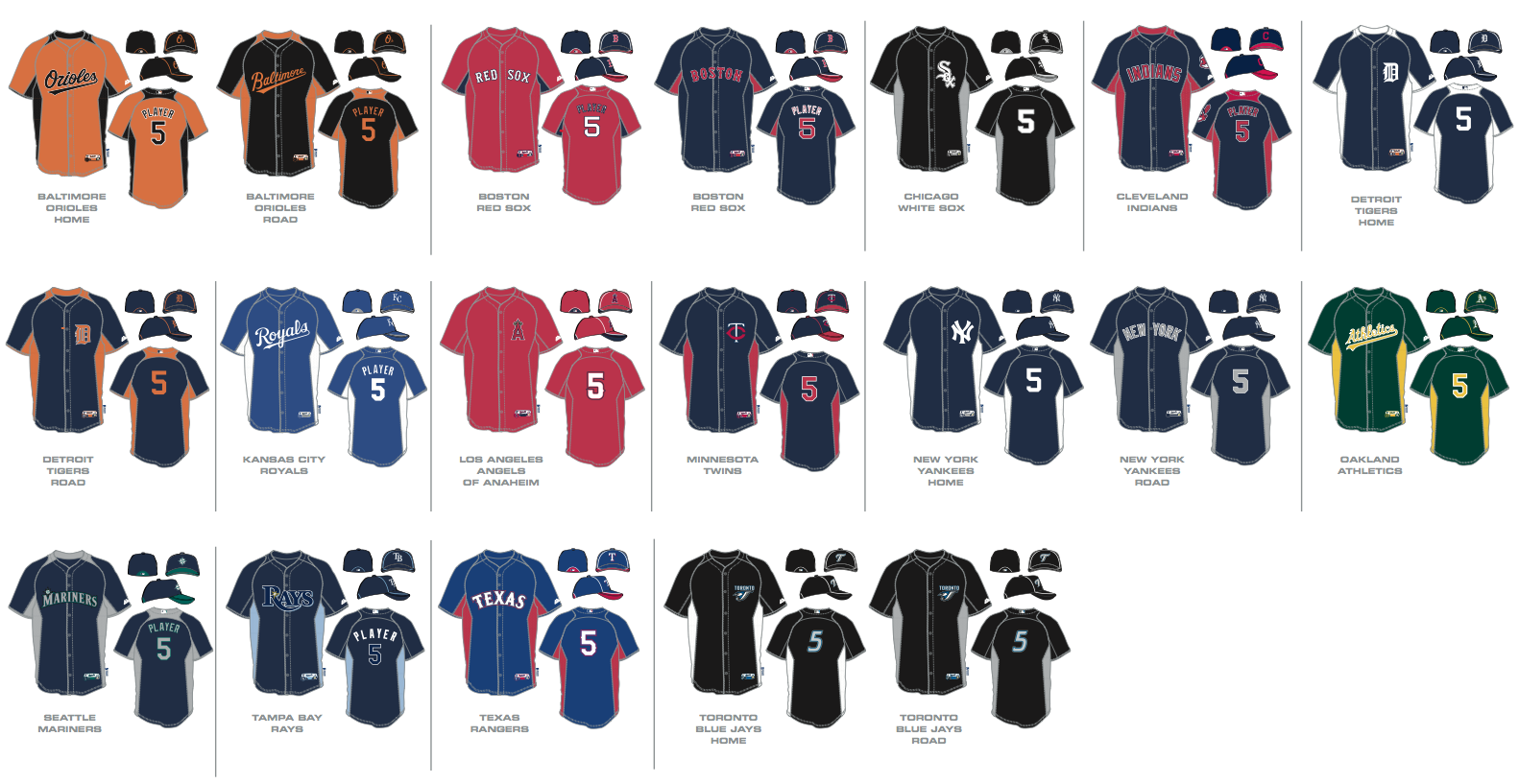
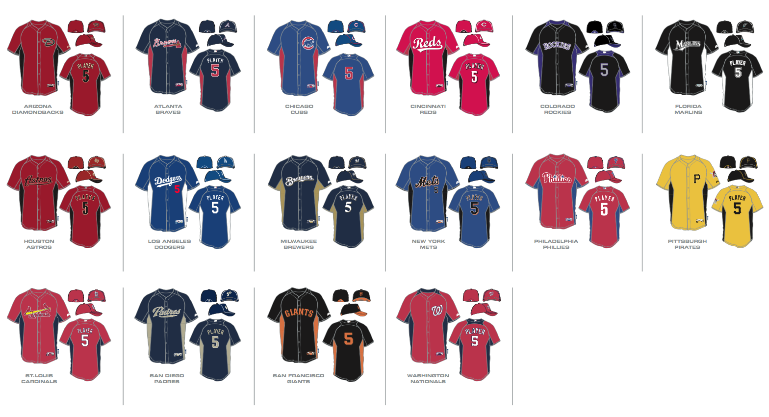
    Here are shots of all the MLB teams Spring Training Jersey's for 2011.

    Feel free to add your commentary. I think the Mets use of black is particularly egregious. But some of the more colorful ones are growing on me, such as the O's Orange one and the Pirates Yellow. Still hoping the Reds retro script grows on me a bit more.



  2. Turn Off Ads?
  3. #2
    Member Jpup's Avatar
    Join Date
    Dec 2004
    Location
    Southern KY
    Posts
    6,997

    Re: The 2011 Spring Training Jerseys

    I think it's pretty sad that only AL East times have 2 versions.
    "My mission is to be the ray of hope, the guy who stands out there on that beautiful field and owns up to his mistakes and lets people know it's never completely hopeless, no matter how bad it seems at the time. I have a platform and a message, and now I go to bed at night, sober and happy, praying I can be a good messenger." -Josh Hamilton

  4. #3
    MassDebater smith288's Avatar
    Join Date
    Jul 2002
    Location
    Lakewood Ranch, FL (by way of Columbus, OH)
    Posts
    7,273
    Reds looks like a cheap wallmart jersey

  5. #4
    Mr.Redlegs is my homeboy Eric_the_Red's Avatar
    Join Date
    Oct 2008
    Location
    Cincinnati
    Posts
    2,171

    Re: The 2011 Spring Training Jerseys

    I don't understand why the Reds decided for that horrible script. It looks like they are the only team to not use their regular font/logo. It is a terrible looking jersey.

  6. #5
    RZ Chamber of Commerce Unassisted's Avatar
    Join Date
    Jul 2003
    Location
    Athens, OH
    Posts
    13,572

    Re: The 2011 Spring Training Jerseys

    I don't care for the piping on the caps. It's a look that'll be dated in a hurry. :

  7. #6
    The Future is Now Ghosts of 1990's Avatar
    Join Date
    May 2008
    Location
    Columbus, OH
    Posts
    4,210

    Re: The 2011 Spring Training Jerseys

    Quote Originally Posted by smith288 View Post
    Reds looks like a cheap wallmart jersey
    Agree. It's easily the worst.
    2009 Attendance Record: 3-5 2010 Attendance Record: 2-9 2015 Attendance Record: 2-0
    2011 Attendance Record: 3-4 2012 Attendance Record: 3-4
    2013 Attendance Record: 5-2 2014 Attendance Record: 3-1

  8. #7
    Member RedsManRick's Avatar
    Join Date
    Dec 2004
    Location
    Guelph, ON
    Posts
    19,448

    Re: The 2011 Spring Training Jerseys

    What's with the black? Didn't we already go down that ugly road?
    Games are won on run differential -- scoring more than your opponent. Runs are runs, scored or prevented they all count the same. Worry about scoring more and allowing fewer, not which positions contribute to which side of the equation or how "consistent" you are at your current level of performance.

  9. #8
    Beware of Fake Posts Screwball's Avatar
    Join Date
    Apr 2007
    Location
    Louisville
    Posts
    2,428

    Re: The 2011 Spring Training Jerseys

    Like most things in baseball, it could be worse. We could be the Pirates.


  10. #9
    Rock n Roll HOF! KittyDuran's Avatar
    Join Date
    Jul 2000
    Location
    Hamilton, Ohio
    Posts
    8,707

    Re: The 2011 Spring Training Jerseys

    Quote Originally Posted by Eric_the_Red View Post
    I don't understand why the Reds decided for that horrible script. It looks like they are the only team to not use their regular font/logo. It is a terrible looking jersey.
    IMHO, the script looks about the same as the Dodgers and Orioles - the big difference is that it's larger because less characters... 4 letters vs 7 letters. We, as Reds fans, are more used to a non-"script" font. I kinda like it and even if I didn't, it's just for Spring Training (at least for now)...
    2024 Reds record attending: 1-0
    2024 Dragons record attending: 0-0
    2024 Y'Alls record attending: 0-0
    "We want to be the band to dance to when the bomb drops." - Simon Le Bon of Duran Duran

  11. #10
    breath westofyou's Avatar
    Join Date
    Oct 2000
    Location
    PDX
    Posts
    57,192

    Re: The 2011 Spring Training Jerseys

    Quote Originally Posted by Eric_the_Red View Post
    I don't understand why the Reds decided for that horrible script. It looks like they are the only team to not use their regular font/logo. It is a terrible looking jersey.
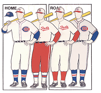
    Looks to me like they took it from the 1936 jerseys


  12. #11
    Member medford's Avatar
    Join Date
    Mar 2002
    Posts
    2,339

    Re: The 2011 Spring Training Jerseys

    Quote Originally Posted by Jpup View Post
    I think it's pretty sad that only AL East times have 2 versions.
    Toronto appears to have the same home/road jersey. Unless the change is subtle, I'm not sure what the difference is. Tampa has only 1 jersey. Of course I believe the Red Sox has a green St Paddy's day jersey (perhaps a few others as well)

    Non the less, I'm not sure why all teams don't have a home/away jersey in ST. If the idea is to give a different look/feel to things to sell more jerseys, why not have all teams w/ a home/away look that is fairly different.

    the yellow pirates look is awful, though I'm sure some would prefer that to a black Pirates ST jersey.

    Regarding the black, I don't see any white jerseys, so my guess is the idea is to sell your home/away white/color jersey plus something drastically different for a ST jersey, which makes black a popular choice.

  13. #12
    Member
    Join Date
    Mar 2004
    Posts
    987

    Re: The 2011 Spring Training Jerseys

    Quote Originally Posted by westofyou View Post
    Looks to me like they took it from the 1936 jerseys
    You would be correct. The script logo has been added to the Reds' style guide as a secondary mark and sounds like it'll be popping up other places around the ballpark and on merch. There's also a giant version of the script on a wall in the lobby of the Reds Development Complex in Arizona.

  14. #13
    breath westofyou's Avatar
    Join Date
    Oct 2000
    Location
    PDX
    Posts
    57,192

    Re: The 2011 Spring Training Jerseys

    Quote Originally Posted by johngalt View Post
    You would be correct. The script logo has been added to the Reds' style guide as a secondary mark and sounds like it'll be popping up other places around the ballpark and on merch. There's also a giant version of the script on a wall in the lobby of the Reds Development Complex in Arizona.
    I figured as much.

    I know they look somewhat odd in the shadow of the larger brand, but in essence they are just like the resurrection of Mr. Redlegs, an attempt to surface former branding items and take advantage of whatever legs they might have in the marketplace. It also comes at a relatively low cost as I'm fairly sure no out of pockets costs can be too crazy when you're dealing with a new logo that is essentially an old logo found in the attic.

    While I find them off putting now, I certainly don't hate them enough to care too much about where and how they are used, and when you throw in the fact that it's a feature that was tied to the 1936 'Roughhouse' Reds I can stomach them much more.


Turn Off Ads?

Posting Permissions

  • You may not post new threads
  • You may not post replies
  • You may not post attachments
  • You may not edit your posts
  •  

Board Moderators may, at their discretion and judgment, delete and/or edit any messages that violate any of the following guidelines: 1. Explicit references to alleged illegal or unlawful acts. 2. Graphic sexual descriptions. 3. Racial or ethnic slurs. 4. Use of edgy language (including masked profanity). 5. Direct personal attacks, flames, fights, trolling, baiting, name-calling, general nuisance, excessive player criticism or anything along those lines. 6. Posting spam. 7. Each person may have only one user account. It is fine to be critical here - that's what this board is for. But let's not beat a subject or a player to death, please.

Thank you, and most importantly, enjoy yourselves!


RedsZone.com is a privately owned website and is not affiliated with the Cincinnati Reds or Major League Baseball


Contact us: Boss | Gallen5862 | Plus Plus | Powel Crosley | RedlegJake | The Operator